

Spatter texture by Scenic Artist Jessica Amador
for Andrew Layton and Kelly Kissinger’s scene design of Oedipus Rex.
Visual
Textures inform us whether or not something will be slimy, furry, prickly or
flawlessly smooth. In order to
effectively create readable textures for the stage, we are familiar with the
idea that the textures might need to be enlarged, their apparent depth enhanced
by color, contrast and even actual size. The reader (your audience member) of
those textures is usually seated in a distant range of 30 to 75 feet away or
more. To provide useful information regarding the textures of the scene, they
need visual assistance from the set designer and scenic artists.

Charred wood and
spatter texture by Scenic Artist Jaime Giovannone. Her website is: http://www.jaimegdesign.com/
The
apparatus that tells us what a texture will be before we touch it combines
information from the physical eye and personal experience. For example, never
having touched angora before in my life, I was prepared to touch something
soft, judging from the apparent shadows and glossy highlights of the fur
fibers. Upon actually touching it, I was astonished at how extremely soft and
fluffy it felt, almost oily and slippery despite the apparent fibers of its fur.
Now, before I touch angora, I know exactly what it will feel like. We are adept at assuming what the texture of
things feels like. By developing a theory and proving it through
experimentation we can for example believe that talcum powder will feel nearly
identical to flour, but not corn meal because of the apparent grain size. Apply
this idea to painted scenery, say, a rough brick wall, and you will likely have
the visual stimulation of your tactile senses because you have touched a
variety of brick walls in your lifetime.

Brick spatter texture by Scenic Artist Jaime
Giovannone.
Visual texture on stage often means creating a kind of
pointillism on an otherwise flat surface. After a scenic artist spatters paint
onto a wall, for example, the surface remains physically flat and the flatness
is relieved by small dots of differently colored paint. The purpose of the
spatter is to diffuse the reflective surface so that whatever is seen against
it is not viewed in harsh contrast or stark flatness. The spatter helps create
a visual disturbance which functions like atmospheric perspective in that it separates
the actors from the background environment.

This is a design for Oedipus Rex. The Scenic
Artist for this show was Jessica Amador. Scene Designers were Andrew Layton and
Kelly Kissinger.
Above in the image of Oedipus Rex is an example of effective
spatter for relieving the surface of totally fake stone. Actors are more easily
seen against the spattered surface. Imagine the doorway on the right if it were
just painted with flat interior paint. It would pull focus away from the
actors.
Scenic artists are adept as visual trickery using spatter. Their
paint spatter can contain dots of color that are different values of the same
hue. For example, a yellow wall on a stage setting could have a spatter system
of light yellow and dark yellow dots on top of a medium yellow base. The wall
will still be a yellow wall, but it will seem more vibrant, and more alive and
less dead flat. Actors and objects in front of the spattered wall will appear
more three dimensional because they are set-off by the variations in spatter
rather than the flat background which had no way of providing a difference to
our perception of textures between the actor and the wall.

This is a sample of
yellow based spatters on a yellow wall, provided by Jenny Knott. Jenny is the
Paint Product Manager for Rosco Laboratories.

Collaborating with a lighting designer, the set designer or
a knowledgeable scenic artist can widen the range of visual texture. The scenic
artist can change the apparent depth and color of the texture on backgrounds to
work in combination with the lighting designer’s color palette for any
particular scene. The result of this collaboration is like magic, and it is
only color theory. Imagine a grey stone
wall. The scenic artist will know to paint the grey color using a mixture of ultra-marine
blue and Van Dyke Brown or some similar combination to make an exciting grey.
Using colors to make grey is an old scenic artist technique developed because
merely adding black to white in order to make grey creates a “dead” color. By
sticking to the use of color to make grey, the scenic artist is providing a
grey which has both warm (brown) and cool (blue) colors in it. This mixture is
often called Payne’s Grey.

Jenny Knott shows how
to spatter the basic greys of mortar color here in preparation for painting a
mortared brick wall.
Armed with a flat grey background that has been painted
using a mixture of colors to make the grey (rather than black and white), the
lighting designer already has a better visual texture from which he or she can make
the tone of the scene warm or cold by applying color theory to bring out the
separate colors. The wall is still truly flat and grey to the audience member
If the scenic artist uses color theory too, the breadth of
the change from applied lighting can be jaw-dropping. Imagine the same grey
wall. Using the fact that the distance of the audience to the stage will help the
audience visually blend the dots of paint, the scenic artist will, on top of
his or her grey wall, spatter a duet or trio of colors. One is a blue-violet
ranged highlight, the second is a deep warm red or Van Dyke Brown dark shadow
color, and the third is the base color grey. Note that the highlight color can
be the warm tone and the shadow color can be the cool color with similar
results.
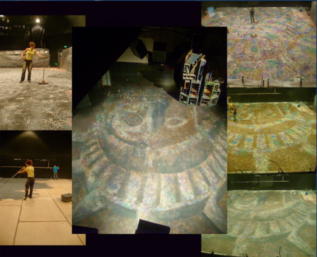
Scenic Artist Jaime
Giovannone shows the steps to create a basic grey but highly colorful and
lighting designer friendly floor for a production of Ragtime designed by Heidi
Hoffer. Layers and layers of color
spatter were applied to make this Lady Liberty floor reactive under many
different lighting conditions.
So, by mixing colors to grey and making that the base color and
spattering colors on top, one can greatly increase the usefulness of the built
environment to fund the play’s meaning. The color theory of spatter success
lies in choosing two or three colors that relate to the colors that make up the
base color. The first relationship is an opaque highlight and the second
relationship is an opaque shadow color. Both spatters can be created from
opposite colors, a purer form of the original colors before blending to make
the grey, or analogous colors. A third spatter color is often a spatter of the
exact same color as the base color of the wall, useful in maintaining an even
spatter.

Scenic artist Jessica Amador used spatter in addition to a
stencil to create this floor which sits above holiday themed decorations. Look
at the next photo to see how rich the floor looks under the light.

The scene design for this lovely Wedgewood
inspired set for Scrooge in Rouge is by Bret Young. Jessica Amador was the Scenic
Artist.
Let me refer you to the online article from The Painter’s
Journal, figure 4 page 14 which shows you the effects of analogus and
complimentary spatter.
It should be understood that any old spatter of something
darker and lighter than the base color will do. Scenic artists often create
visual texture on a piece of scenery by spattering it with “dirty water” to break
up to otherwise flat surface as illustrated below. Dirty water spatter is
sometimes not completely opaque and is used to help disparate elements on a
painting look like they are all in one painting as in Diane Fargo’s image
below.

Blood Wedding floor spatter treatment by Jessica
Amador. Scene designers were Andrew Layton and Kelly
Kissinger.
.jpg)
The dirty water
spatter here, done by Scenic Charge Diane Fargo, successfully marries the blue
surface, the rope border, and the fringe at the bottom.
But to really broaden
the range and usefulness of visual texture one must collaborate with the other
designers on their color palettes and choose spatter colors that will actually
be able to be pulled out by lighting and contrast with the costume colors for a
particular scene. Interestingly, under
normal work light you would only see a basic grey wall. It is only when
lighting is applied that deadens or resonates with the spatter colors that you
get exciting and useful visual texture.
For a few different paint texture techniques, let me direct
you to “Creating Textured Surfaces” written by Jenny Knott for The Painter’s
Journal. Jenny is the Paint and Coatings
Product Manager for Rosco.
Spatter is Visual Magic Special thanks to Jessica Amador, Diane Fargo courtesy of Jenny Knott, Jenny Knott, and Jaime Giovannone.


