Here is a journey through Wilhelm Gause's painting showing how the use of crowds can aid in the storytelling aspect of any film moment of book illustration or painting. This link takes you to Zana Bihiku Tutt'Art's page with lots of ads which are distracting, but the content is still useful.
Friday, April 15, 2022
Sunday, May 29, 2016
Professor Perspective Explains Human Scale and Proscenium Proportions
When explaining how to manage perspective to someone, it is
a good idea to really talk about relationships and proportion and distance and
all of that. We begin with the basic height of a figure, because all
perspective drawings are in relation to something, such as the human figure. So
that the students are not thrown off by stopping to draw the perfect human
figure, I establish this basic bowling pin figure, which is easy to replicate,
and can be made fat or thin and tall and short or sitting in a chair…
![]() |
| Copyright Heidi Hoffer. If you use this please credit Heidi Hoffer |
The person usually is off to the side in a proscenium
picture, establishing an immediate visual scale. Very much like the figure
artist using the head to determine, “How many head down is the chin, the chest,
the navel, the crotch, the knee, and so on, we use the figure in a similar way.
We’ll establish “How many people tall is the proscenium?” and, “How many people
wide is the proscenium?.”
You might ask, “Well, why can’t we just use a tape measure
to answer that?” And the answer is because you should think about all things in
relationship to the human, not the tape measure. There is a visceral reaction
to geometry we can react to when we have a human scale. Using a figure to
establish a visual scale will immediately provide a buy-in from the viewer.
And, believe me; the viewer will toss away any visual that feels incorrect even
if a tape measure says otherwise. This is because people are attuned to certain
geometric harmonies.
So, here’s the basic theatre proscenium in relationship to
human scale. It is not a GOLDEN RECTANGLE http://www.miniwebtool.com/golden-rectangle-calculator/?a=20
but it is a satisfying ratio, considering how the sides of a proscenium are largely ignored for stage action, unless there’s vignette scene happening way down right.
![]() |
| Copyright Heidi Hoffer. If you use this please credit Heidi Hoffer |
For a 42 foot wide proscenium, the height should be 26 feet
for the golden rectangle. But, since we reduce the size of the proscenium to
something our budget can manage to fill, we usually design with something
closer to the golden ratio, such as a width of 34 feet and a height of 20 feet.
The void is filled with a proscenium arch or black stage curtains.
Since the proscenium is usually the plane at which we can
measure accurately, knowing that things get visually smaller as they recede
from us or move upstage, this is a good place to have the human for scale. It
is called THE PICTURE PLANE. I like to think of it is the proscenium with which
we are all familiar.
![]() |
| Copyright Heidi Hoffer. If you use this please credit Heidi Hoffer |
Labels:
2D,
art,
Heidi Hoffer,
perspective,
proscenium
Sunday, April 24, 2016
Professor Perspective
World by Design highlights design elements that catch my
eye. Today’s design elements are brought to you by Professor Perspective.
Since some professors like to wear bow ties, I will honor
them by using the classic bow tie to show the basic perspective idea that what’s
above the horizon line goes down to it as is recedes upstage away from the viewer,
and what’s below the horizon line goes up to it. Many perspective vanishing
points can be used this way.
The multiple
vanishing point possibilities makes this perspective form better for coming
close to reality than the one-point perspective (train tracks and telephone
poles receding in the distance)
Just for reference,
here’s the old one point perspective. This is very limiting!
Friday, December 18, 2015
The Drapery...of trust
And this is the beautiful drapery, valence and header for the window unit pictured below. It took a team of artisans to create just this one special section of the scenery. It was beautiful.
Sunday, September 27, 2015
Process and Trust for Design
I'd like to consider how a 2D drafted thing becomes a reality.
Typically we've got a sketch, drafting, sometimes an exquisite model piece, a 3D drafting sometimes, and the final version before paint, the painter's elevation, and then the full final version. There's a lot of trust going on in the creation of this art! It take scores of people to bring to fruition.
Labels:
2D,
AutoCAD,
Blithe Spirit.,
Heidi Hoffer,
theatre
Sunday, May 11, 2014
Spatter is Magical Visual Texture
Spatter texture by Scenic Artist Jessica Amador
for Andrew Layton and Kelly Kissinger’s scene design of Oedipus Rex.
Visual
Textures inform us whether or not something will be slimy, furry, prickly or
flawlessly smooth. In order to
effectively create readable textures for the stage, we are familiar with the
idea that the textures might need to be enlarged, their apparent depth enhanced
by color, contrast and even actual size. The reader (your audience member) of
those textures is usually seated in a distant range of 30 to 75 feet away or
more. To provide useful information regarding the textures of the scene, they
need visual assistance from the set designer and scenic artists.
Charred wood and
spatter texture by Scenic Artist Jaime Giovannone. Her website is: http://www.jaimegdesign.com/
The
apparatus that tells us what a texture will be before we touch it combines
information from the physical eye and personal experience. For example, never
having touched angora before in my life, I was prepared to touch something
soft, judging from the apparent shadows and glossy highlights of the fur
fibers. Upon actually touching it, I was astonished at how extremely soft and
fluffy it felt, almost oily and slippery despite the apparent fibers of its fur.
Now, before I touch angora, I know exactly what it will feel like. We are adept at assuming what the texture of
things feels like. By developing a theory and proving it through
experimentation we can for example believe that talcum powder will feel nearly
identical to flour, but not corn meal because of the apparent grain size. Apply
this idea to painted scenery, say, a rough brick wall, and you will likely have
the visual stimulation of your tactile senses because you have touched a
variety of brick walls in your lifetime.
Brick spatter texture by Scenic Artist Jaime
Giovannone.
Visual texture on stage often means creating a kind of
pointillism on an otherwise flat surface. After a scenic artist spatters paint
onto a wall, for example, the surface remains physically flat and the flatness
is relieved by small dots of differently colored paint. The purpose of the
spatter is to diffuse the reflective surface so that whatever is seen against
it is not viewed in harsh contrast or stark flatness. The spatter helps create
a visual disturbance which functions like atmospheric perspective in that it separates
the actors from the background environment.
This is a design for Oedipus Rex. The Scenic
Artist for this show was Jessica Amador. Scene Designers were Andrew Layton and
Kelly Kissinger.
Above in the image of Oedipus Rex is an example of effective
spatter for relieving the surface of totally fake stone. Actors are more easily
seen against the spattered surface. Imagine the doorway on the right if it were
just painted with flat interior paint. It would pull focus away from the
actors.
Scenic artists are adept as visual trickery using spatter. Their
paint spatter can contain dots of color that are different values of the same
hue. For example, a yellow wall on a stage setting could have a spatter system
of light yellow and dark yellow dots on top of a medium yellow base. The wall
will still be a yellow wall, but it will seem more vibrant, and more alive and
less dead flat. Actors and objects in front of the spattered wall will appear
more three dimensional because they are set-off by the variations in spatter
rather than the flat background which had no way of providing a difference to
our perception of textures between the actor and the wall.
This is a sample of
yellow based spatters on a yellow wall, provided by Jenny Knott. Jenny is the
Paint Product Manager for Rosco Laboratories.
Collaborating with a lighting designer, the set designer or
a knowledgeable scenic artist can widen the range of visual texture. The scenic
artist can change the apparent depth and color of the texture on backgrounds to
work in combination with the lighting designer’s color palette for any
particular scene. The result of this collaboration is like magic, and it is
only color theory. Imagine a grey stone
wall. The scenic artist will know to paint the grey color using a mixture of ultra-marine
blue and Van Dyke Brown or some similar combination to make an exciting grey.
Using colors to make grey is an old scenic artist technique developed because
merely adding black to white in order to make grey creates a “dead” color. By
sticking to the use of color to make grey, the scenic artist is providing a
grey which has both warm (brown) and cool (blue) colors in it. This mixture is
often called Payne’s Grey.
Jenny Knott shows how
to spatter the basic greys of mortar color here in preparation for painting a
mortared brick wall.
Armed with a flat grey background that has been painted
using a mixture of colors to make the grey (rather than black and white), the
lighting designer already has a better visual texture from which he or she can make
the tone of the scene warm or cold by applying color theory to bring out the
separate colors. The wall is still truly flat and grey to the audience member
If the scenic artist uses color theory too, the breadth of
the change from applied lighting can be jaw-dropping. Imagine the same grey
wall. Using the fact that the distance of the audience to the stage will help the
audience visually blend the dots of paint, the scenic artist will, on top of
his or her grey wall, spatter a duet or trio of colors. One is a blue-violet
ranged highlight, the second is a deep warm red or Van Dyke Brown dark shadow
color, and the third is the base color grey. Note that the highlight color can
be the warm tone and the shadow color can be the cool color with similar
results.
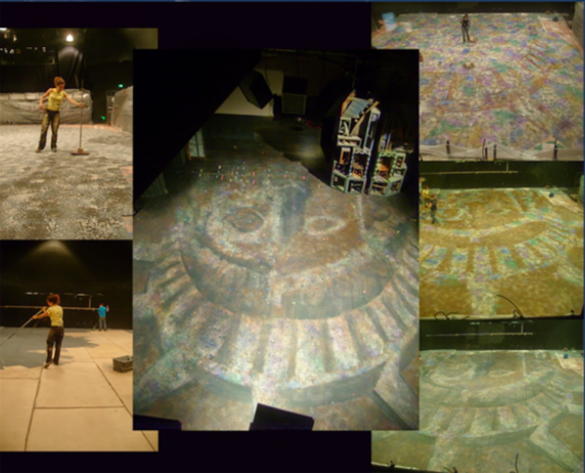
Scenic Artist Jaime
Giovannone shows the steps to create a basic grey but highly colorful and
lighting designer friendly floor for a production of Ragtime designed by Heidi
Hoffer. Layers and layers of color
spatter were applied to make this Lady Liberty floor reactive under many
different lighting conditions.
So, by mixing colors to grey and making that the base color and
spattering colors on top, one can greatly increase the usefulness of the built
environment to fund the play’s meaning. The color theory of spatter success
lies in choosing two or three colors that relate to the colors that make up the
base color. The first relationship is an opaque highlight and the second
relationship is an opaque shadow color. Both spatters can be created from
opposite colors, a purer form of the original colors before blending to make
the grey, or analogous colors. A third spatter color is often a spatter of the
exact same color as the base color of the wall, useful in maintaining an even
spatter.
Scenic artist Jessica Amador used spatter in addition to a
stencil to create this floor which sits above holiday themed decorations. Look
at the next photo to see how rich the floor looks under the light.
The scene design for this lovely Wedgewood
inspired set for Scrooge in Rouge is by Bret Young. Jessica Amador was the Scenic
Artist.
Let me refer you to the online article from The Painter’s
Journal, figure 4 page 14 which shows you the effects of analogus and
complimentary spatter.
It should be understood that any old spatter of something
darker and lighter than the base color will do. Scenic artists often create
visual texture on a piece of scenery by spattering it with “dirty water” to break
up to otherwise flat surface as illustrated below. Dirty water spatter is
sometimes not completely opaque and is used to help disparate elements on a
painting look like they are all in one painting as in Diane Fargo’s image
below.
Blood Wedding floor spatter treatment by Jessica
Amador. Scene designers were Andrew Layton and Kelly
Kissinger.
The dirty water
spatter here, done by Scenic Charge Diane Fargo, successfully marries the blue
surface, the rope border, and the fringe at the bottom.
But to really broaden
the range and usefulness of visual texture one must collaborate with the other
designers on their color palettes and choose spatter colors that will actually
be able to be pulled out by lighting and contrast with the costume colors for a
particular scene. Interestingly, under
normal work light you would only see a basic grey wall. It is only when
lighting is applied that deadens or resonates with the spatter colors that you
get exciting and useful visual texture.
For a few different paint texture techniques, let me direct
you to “Creating Textured Surfaces” written by Jenny Knott for The Painter’s
Journal. Jenny is the Paint and Coatings
Product Manager for Rosco.
Spatter is Visual Magic Special thanks to Jessica Amador, Diane Fargo courtesy of Jenny Knott, Jenny Knott, and Jaime Giovannone.
Labels:
Diane Fargo,
Jaime Giovannone,
Jenny Knott,
scene painting,
Spatter
Monday, May 13, 2013
The Greying by Nature
As things weather over time, they obtain more and more
character, and often turn grey. The façade of this mountain cabin pictured below is streaked with dark lines where
the wood has darkened. At the base where the snow sits for a long time, the
wood is actually turning grey. The exterior wall of this cabin is showing signs
of age and weathering but the warm color is still mostly there. This is a great
study for rustic pine wood paneling. It occurs to me that as we age we obtain
more and more grey hair, too.
![]() |
| Photo by Heidi Hoffer. All Rights Reserved. |
![]() |
| Photo by Heidi Hoffer. All Rights Reserved. |
![]() |
| Photo by Heidi Hoffer. All Rights Reserved. |
![]() |
| Photo by Heidi Hoffer. All Rights Reserved. |
Wednesday, December 26, 2012
Dragons and Other Medieval Animal Zoomorphs
The Musée National du Moyen Âge in Paris, France has the
best and most approachable collection of pieces. Medieval works are featured here, including the Celtic chair discussed below. The lighting is difficult for photographers
in the wintertime, but manageable using a clever camera. Photography is allowed
in the museum with no flash. Photographers must use existing light only.
What
struck me most about the medieval times represented is the penchant for
dragons. Even in the Christian religion there is the St. George and the Dragon
story, which some scholars believe is a very early story used to undermine the
old ways (dragon) in favour of new ways (Christianity) when that religion was
introduced to the Celtic lands.
![]() |
| Photo by Heidi Hoffer. All rights reserved. |
The first four photographs here are of the wooden Celtic
chair; the design of the dragons and other beasts is merely decorative and
possibly inspired by a story or myth of power.
I was amazed that an extant wooden chair from the 11th
century existed in such good shape, and that the Celtic peoples HAD chairs of
this nature in the first place. It’s linear outline or silhouette is Roman or
Egyptian, but the décor is heavily Celtic.
The front seat rear rail contains these carving of men and
dragons. I thought they looked mostly like dragons trying to break out of an egg.
![]() |
| Photo by Heidi Hoffer. All rights reserved. |
The front rail of this chair seat shows what looks like
horses, lions and more dragons.
![]() |
| Photo by Heidi Hoffer. All rights reserved. |
The central splat at the back is cruciform in shape, the
center of which shows a twisting dragon in a roundel. There are additional
serpentine shapes on the cross arms.
![]() |
| Photo by Heidi Hoffer. All rights reserved. |
For interesting but not necessarily verified reading on
Dragon lore, check out Reptilian Agenda’s article http://www.reptilianagenda.com/hist/h110599a.shtml
and neka’s http://www.slideserve.com/neka/mystery-of-a-dragon-and-a-code-of-the-bayeux-tapestry
For the Musée de Moyen Âge (Musée de Cluny) website check
this in French: http://www.musee-moyenage.fr/
The zoomorphic ornament and interlaced designs featured in
the chair above are relatively flat, bas relief carvings. A similar central design
emblem is the lion’s head seen on the fencing around the l'Hôtel de Ville (Paris), in
slightly more relief than the carved wood.
![]() |
| Photo by Heidi Hoffer. All rights reserved. |
In this sense, like the fully sculpted lions that often
guard entrances to city buildings, the lion seems to be a security device,
proclaiming that power resides within the grounds or building. Indeed, most
door-knockers on formal (Roman inspired) facades feature a lion’s head. This great image of a Medieval Lion Head door
knocker I purchased from Dragoneye at Dreamstime:
© Dragoneye | Dreamstime.com (© Dragoneye | Dreamstime.com)
![]() |
Old medieval iron door knocker in shape of lion head isolated on white background with clipping path. © Dragoneye | Dreamstime.com
|
![]() |
| Photo by Izzy Burton. All Rights Reserved. http://www.flickr.com/photos/izzyburton/ |
![]() |
| Photo by Heidi Hoffer. All rights reserved. |
![]() |
| Photo by Heidi Hoffer. All rights reserved. |
The next item is a drinking vessel. It starts out with a
round rim and handle like any mug, but it turns into a horn (evoking the old
fashioned real animal horn drinking vessels) which ends in an amazing wolf’s
head flourish. Again, I rather like the idea that the drinker is imbibing the
characteristic of a wolf…
![]() |
| Photo by Heidi Hoffer. All rights reserved. |
You never see a lamb’s head drinking horn, or a pig-head
one, so obviously those animals have a lesser character of strength and
virility and cleverness.
Returning to the purely decorative, but in a more
three-dimensional way, are these snakes which twine themselves around a crystal
chalice. They don’t actually do anything except hold the crystal goblet to the
golden base. The effort and realism here
is what caught my eye. I did wonder about the snake which sheds its skin and
has a bad reputation in Christianity as a choice for a chalice, though.
![]() |
| Photo by Heidi Hoffer. All rights reserved. |
Lastly, there are these cute little salamanders which peek
out underneath a heavy armoire. The top of the armoire features bull’s heads,
and underneath are these little guys who look to scare someone who is sneaking
into the cupboard unawares. These carvings are about the size of iguanas in
real life, and have no teeth! They serve a purely decorative purpose, and are
not useful to humans using the armoire.
![]() |
| Photo by Heidi Hoffer. All rights reserved. |
Labels:
Celtic,
dragon,
Dragoneye,
medieval,
middle ages,
musee de moyen age,
wood carving,
zoomorphic
Saturday, November 24, 2012
Scottish Festival Personalities: War Re-enactors and Artists
As I travel around the world I am always interested in the
choices people make for personal adornment. This could be as simple as deciding
which earrings to wear to deciding how to complete a serious re-enactment
outfit. At the Oklahoma Scottish Festival I saw a good bit of both, and also
noted that somehow 19th century artillery re-enactors got involved
in the festival, too. They even got to shoot off their cannons.
![]() |
River West Festival Park in Tulsa, Oklahoma
|
![]() |
| This handsome fellow roamed the festival. |
The performers had to shift for themselves, it seems. This
musician re-worked the sound system to make things better.
![]() |
| Scottish Musician |
Scottish music abounded throughout, but my acoustic favorite
was these harpers. A whole stage full of them created quite an astounding
sound!
![]() |
| Harper |
Potters, it seems can visit every fair and fit right in,
Scottish or not. This lady had the patience of a saint as children would ask
her many, many questions. She had excellent skills and was throwing
well-balanced wares on her wheel as we watched.
![]() |
| Potter |
This father and son duo caught my eye and I asked if I could
take their picture. They were delighted, and very happy to pose. I believe they
were not unique in their zeal for the fair, but they looked like they had the
most fun.
![]() |
| Father and Son Duo |
At the MacPherson tent, I found the patriarch tuning on a
set of parlor pipes. Excellent playing, and his hands were astoundingly agile
and delicate as they coursed over the holes. Wonderful clan with whom I could
be associated!
![]() |
| MacPherson |
This black shirted and kilted onlooker framed nicely the
father and son in Kilted regalia. The Scottish Festival is being passed down to
the next generation for sure.
![]() |
| Generations |
Subscribe to:
Posts (Atom)


.jpg)