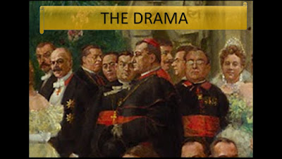
Here is a journey through Wilhelm Gause's painting showing how the use of crowds can aid in the storytelling aspect of any film moment of book illustration or painting. This link takes you to Zana Bihiku Tutt'Art's page with lots of ads which are distracting, but the content is still useful.
Friday, April 15, 2022
Sunday, May 29, 2016
Professor Perspective Explains Human Scale and Proscenium Proportions
When explaining how to manage perspective to someone, it is
a good idea to really talk about relationships and proportion and distance and
all of that. We begin with the basic height of a figure, because all
perspective drawings are in relation to something, such as the human figure. So
that the students are not thrown off by stopping to draw the perfect human
figure, I establish this basic bowling pin figure, which is easy to replicate,
and can be made fat or thin and tall and short or sitting in a chair…
 |
| Copyright Heidi Hoffer. If you use this please credit Heidi Hoffer |
The person usually is off to the side in a proscenium
picture, establishing an immediate visual scale. Very much like the figure
artist using the head to determine, “How many head down is the chin, the chest,
the navel, the crotch, the knee, and so on, we use the figure in a similar way.
We’ll establish “How many people tall is the proscenium?” and, “How many people
wide is the proscenium?.”
You might ask, “Well, why can’t we just use a tape measure
to answer that?” And the answer is because you should think about all things in
relationship to the human, not the tape measure. There is a visceral reaction
to geometry we can react to when we have a human scale. Using a figure to
establish a visual scale will immediately provide a buy-in from the viewer.
And, believe me; the viewer will toss away any visual that feels incorrect even
if a tape measure says otherwise. This is because people are attuned to certain
geometric harmonies.
So, here’s the basic theatre proscenium in relationship to
human scale. It is not a GOLDEN RECTANGLE http://www.miniwebtool.com/golden-rectangle-calculator/?a=20
but it is a satisfying ratio, considering how the sides of a proscenium are largely ignored for stage action, unless there’s vignette scene happening way down right.
 |
| Copyright Heidi Hoffer. If you use this please credit Heidi Hoffer |
For a 42 foot wide proscenium, the height should be 26 feet
for the golden rectangle. But, since we reduce the size of the proscenium to
something our budget can manage to fill, we usually design with something
closer to the golden ratio, such as a width of 34 feet and a height of 20 feet.
The void is filled with a proscenium arch or black stage curtains.
Since the proscenium is usually the plane at which we can
measure accurately, knowing that things get visually smaller as they recede
from us or move upstage, this is a good place to have the human for scale. It
is called THE PICTURE PLANE. I like to think of it is the proscenium with which
we are all familiar.
 |
| Copyright Heidi Hoffer. If you use this please credit Heidi Hoffer |
Labels:
2D,
art,
Heidi Hoffer,
perspective,
proscenium
Subscribe to:
Comments (Atom)


